SalusX
Building Trust Through Design
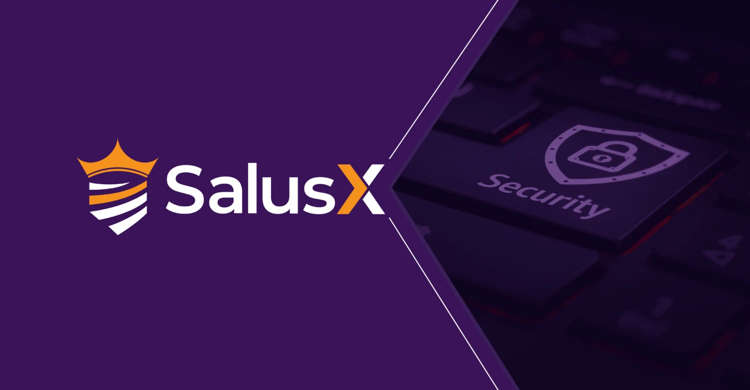
The SalusX brand identity is designed to reflect its cutting-edge approach to cybersecurity, blending innovation with a strong sense of reliability. The visual system balances modern typography with a structured yet fluid composition, representing both adaptability and precision in the ever-evolving digital security landscape.
A strategic color palette of teal, orange, and deep purple reinforces the brand’s positioning-teal symbolizes trust and security, orange conveys urgency and innovation, while deep purple adds a sense of sophistication and expertise. This fusion of colors, along with geometric elements and refined gradients, creates a forward-thinking and authoritative brand presence.


IMPACT OF OUR WORK
The branding exercise for SalusX has elevated its market presence, ensuring a bold and cohesive identity that resonates with businesses seeking top-tier cybersecurity solutions.
By crafting a streamlined visual system and standardized brand guidelines, we have positioned SalusX as a trusted leader in the industry. This cohesive identity not only enhances brand recognition but also strengthens its messaging, instilling confidence in organizations looking to safeguard their digital future.
